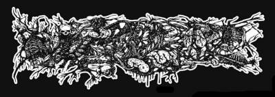
Well, I kinda think it's unfair to write letters within letters and a tone of lines that don't count that are just as thick as the lines that do count. Lots of bands have lines all over, but you can tell they don't count 'cause they're thinner.
As for the new one, I can clearly see 'MORBID', and 'ANGEL', but seperately. And then taking the
Fact that you make letters out of lines everywhere, just about any word could be seen here.
I can see 'TBRFAT' as well.
Actually, now that I look at it, I can totally see FAT at the end.
I do album art for bands! Send me a Message or email [email protected] for more info. My website: http://curtisbotham.weebly.com/
/pics/179675_logo.jpg)


