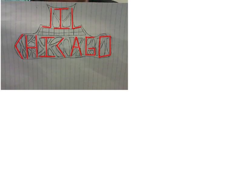
Are you combining letters on this logo?
'Cause if you are the top row has an M, a T and a Y. (Is it supposed to be a compression of the word 'mighty'? Or TYM/TIM, MYT...
I think I'm going with TIM for the top row.
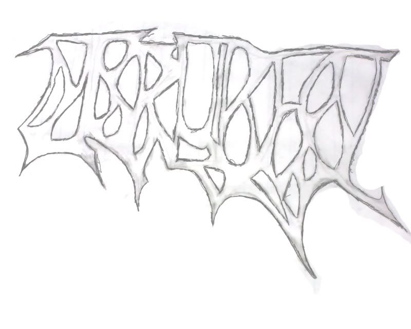
Then there's a weird thing that looks like a cartoony set of teeth for the second row that I'm assuming says nothing.
And then the third row goes either with an "ONAT" or "OVTA", and then "DK" or "DR", then finally "TOABA" or "COBRA". So what I'm getting doesn't make any sense. So I ask these questions about it:
Are some of the lines 'tricks' and don't form anything?
Are some of the letters formed by the spaces in between rather than the 'solid' areas?
How close am I right now?
I do album art for bands! Send me a Message or email [email protected] for more info. My website: http://curtisbotham.weebly.com/