Artworks >> Awesome logos
Share to Facebook Share to Myspace Share to Twitter Stumble It Email This More...

 
Friday 18 March 2011 - 13:29:10
what are your favourite Logos
 
post em here!
 
Personally I really like Black Metal logos. It seems like they have put some thought in some of the logos. Not just typed it up on Word with Westwood font 0


Friday 18 March 2011 - 14:33:27

Dimmu Borgir's original logo ('93-'97)
Even though Dimmu isn't my favorite Black Metal band (even back when they were good), this is the best band logo I've ever seen. Well, drawn, all the letters are clear and easy to read, but it's organized in a really clever way. It's practically simmetrical. And I just think it's beautifully drawn. Too bad the original logo artist was never credited...

Saturday 19 March 2011 - 12:13:24

citation :
InfinityZero says :

 
To me it looks like a bulldog's Head 0
 
This is probably my all time favourite Black Metal logo.


dunno why, just something about it appeals to me 0

Saturday 19 March 2011 - 15:43:29


citation :
miniradman says : 
 
This is probably my all time favourite Black Metal logo.


dunno why, just something about it appeals to me 0

 
I don't really like it. It doesn't look good on their album covers; it just looks like a scribble when it's put into context of an album cover. For example:

 
Anyway, the band must've figured that out, 'cause they don't even use that logo on their cover art anymore.
It looks really interesting by itself, though.
 
Oh, I also rather like the logo of one of the Million bands called Leviathan:

Nice use of imagery in the picture.

Saturday 19 March 2011 - 15:48:22
I think its weird how some Logos can look good by them self but not on a cover. And some look like crap or look a little "corny" by themself but look really good on an album cover. I think Mayhem's Logos look really good on covers.


Saturday 19 March 2011 - 15:52:21
Yeah, Mayhem's logo is great.
Did you know that Maniac is The One who designed it? That's like, The One good thing he ever did for the band. Anyway, Mayhem's logo is so good they used it by itself for album art of Wolf's Lair Abyss.

Sunday 20 March 2011 - 20:31:43
Behexen


Evilfeast


Ancestral Fog


Abyssmal Nocturne


Hooded Menace


Wrath Passion


Krvnik


Crebain


Impaled Nazarene


Inquinok


Vorphalack


Monday 21 March 2011 - 08:06:38
Behexen - Yes 0 
Evilfeast - meh 0
Ancestral Fog - meh 0
Abyssmal Nocturne - wtf 0 
Hooded Menace - yes 0 
Wrath Passion - AWESOME! 0
Krvnik - meh 0
Crebain - meh 0
Impaled Nazarene - eh 0
Inquinok - Cool 0
Vorphalack - SICK! 0 
 
you have posted some really good Logos there 0  


Monday 21 March 2011 - 17:34:43
My favorite logo in that compilation had to be KrvnK.
I don't like Logos that jam a Random picture in them, like for Hooded Menace. I'm fine if they utilize the letters to create a picture (like the Leviathan one I posted), but just having a picture of a Skull or a devil is kinda blah. I'd prefer to see just letters/letters that form a picture.
 

Here's a logo that sorta contradicts what I was saying, but this is one of those few exceptions. Beautiful stuff, and I can tell the guy in the band likes Christmas trees.
It's a great ambient Black Metal band, they have a lot of keyboard-only tracks that're just great (In the Caves of Enceladus, Under the Glacier).
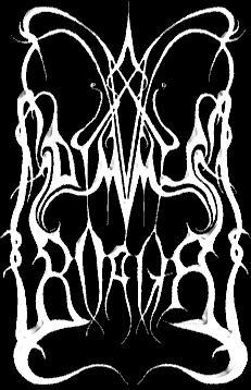
Oh, if you can't read that logo, the band's called Forgotten Land.
 
By the way, the guy in the band limits the crap out of how many copies of his CDs are made. The debut album only has 111 copies in Existence, and one of the EPs only has 25 copies. So if you see a Forgotten Land Cd, tape or vinyl...
buy it.

Tuesday 22 March 2011 - 07:35:07

citation :
InfinityZero says :  

Here's a logo that sorta contradicts what I was saying, but this is one of those few exceptions

 
awww... I was just about to post that logo myself.
 
Yeah I love many of the Logos that have branches and foliage all over the play. I don't know why 0


Ok this one might be a little over the top, but still. I like it 0